StoryBrand Website Examples
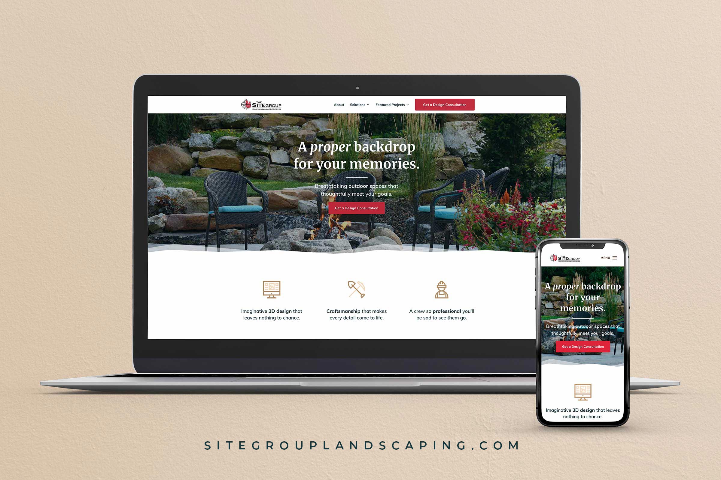
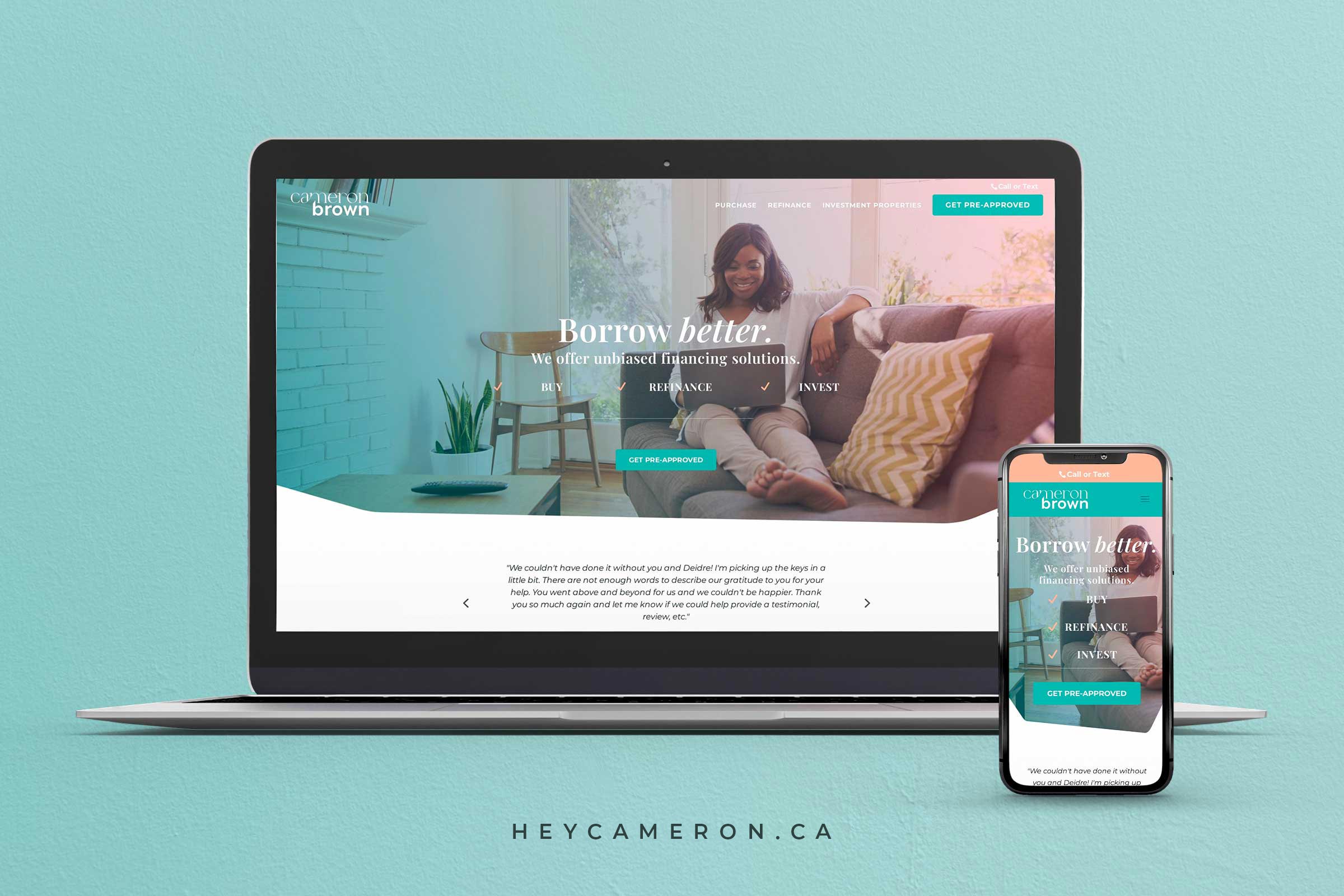
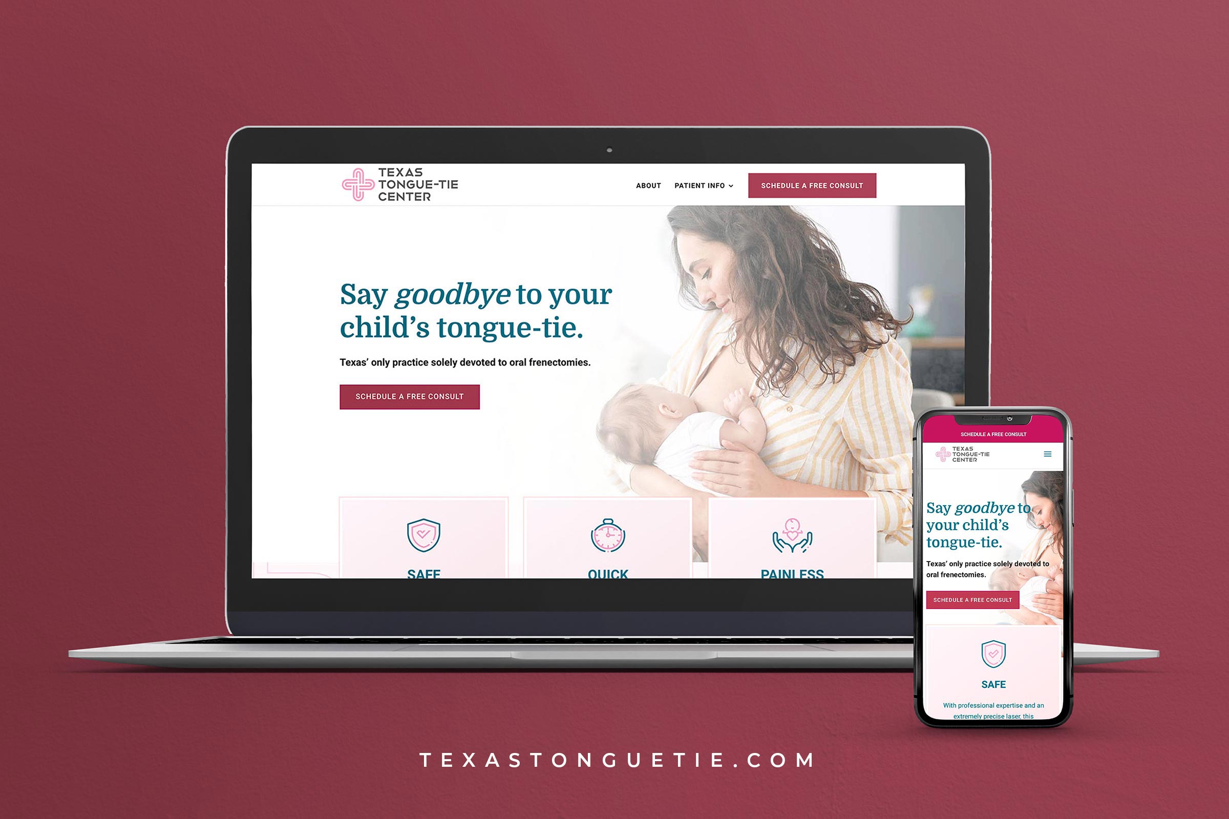
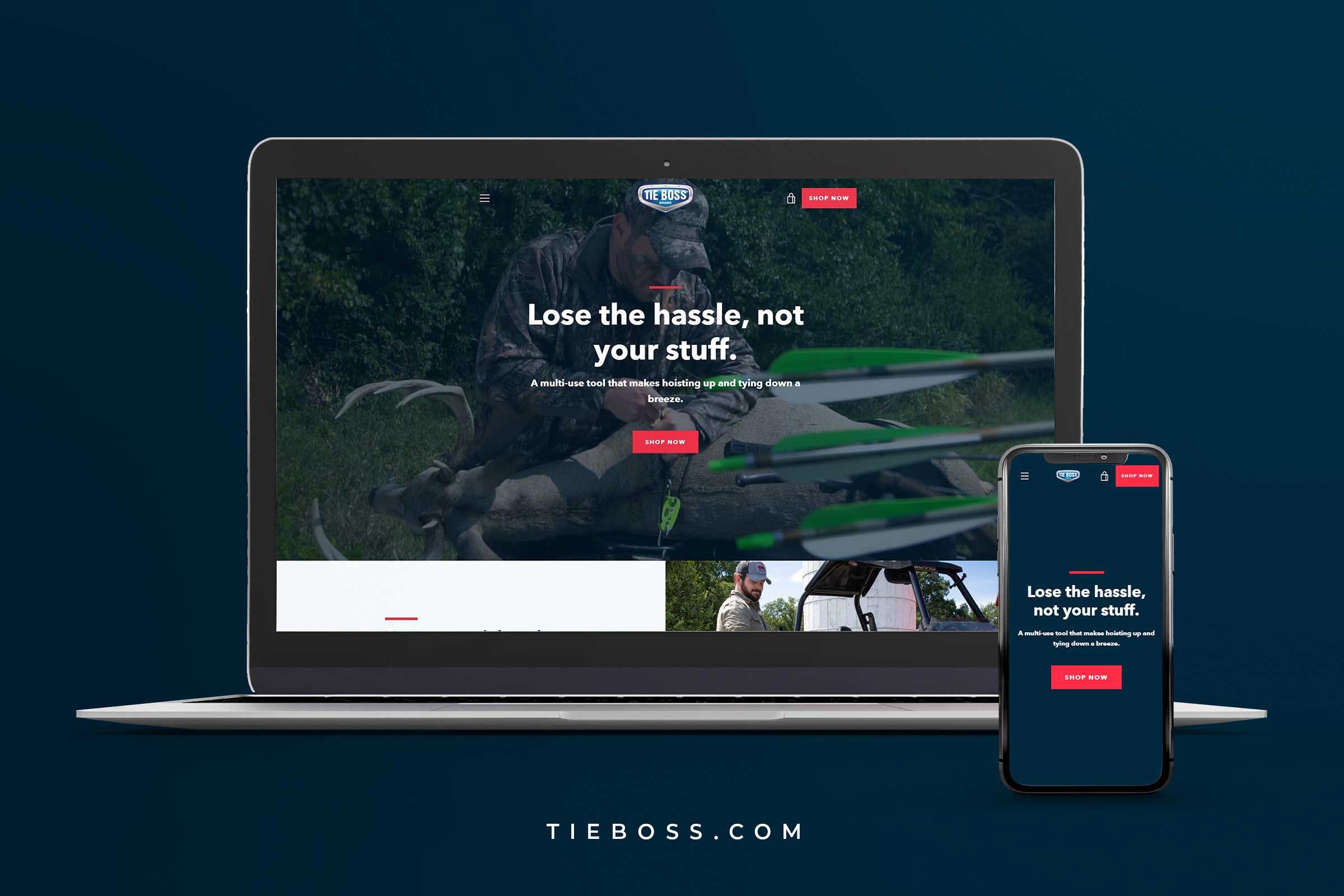
We’ve partnered with Angie Schultz, StoryBrand Certified Guide, to help dozens and dozens of business owners design and build StoryBrand websites.
Here are some hand-picked website examples from our team at Agency Boon.
Angie Schultz
StoryBrand Certified Guide
You + StoryBrand = A Winning Combination
You discovered StoryBrand and you realize it’s an absolute goldmine but you’re unsure of how to implement it on your website. This is why we came up with this comprehensive guide – to showcase what real StoryBrand website examples look like.
We’ve helped dozens and dozens of StoryBrand-loving businesses and organizations tell the right message, to the right audience, in the right way with StoryBrand. That is our hope for you as well. That you’d take these examples, learn from them, and leverage the power of StoryBrand for your business. Here’s to a clarified message and a StoryBranded website.
StoryBrand Website Examples
The Most Important Sections of a StoryBrand Website:
Here’s how to put together a StoryBrand website
Nothing exemplifies a framework like a few good examples.
Since the book Building a StoryBrand was released in 2017, business owners and leaders have been clamoring for inspiration as to how they can implement the framework on their websites and other marketing collateral.
The StoryBrand framework, as it relates to your website, consists of 7-10 basic content blocks.
• The Header/Hero
• The Stakes
• The Value Proposition
• The Guide
• The Plan
• Explanatory Paragraph
• Video
• Price Choices
• Lead Generator
• Junk Drawer
In this section, we’re going to look at several StoryBrand website examples and highlight a specific part of the framework using each website.
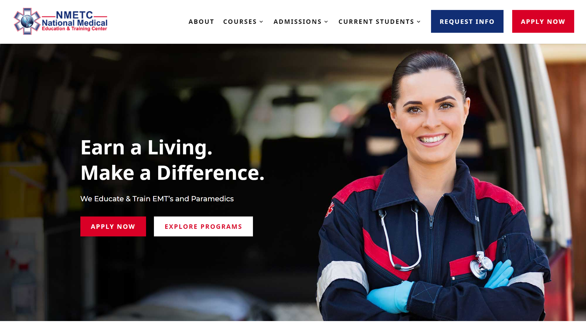
This example comes from the National Medical Education and Training Center.
Your header/hero section is arguably the most valuable section of your website. It’s the first thing users see when they land on your site.
To have an easy-to-understand header/hero section, you’ll want to include a few things:
- A clear call-to-action button in the upper right-hand corner and the center of the page
- Preferably, an image of happy people (ideally someone from your target market)
- Customer-focused copy that answers these three questions: what you do, what you offer, and how it can make the customer’s life better.
If you put all these elements together, you’ll have a header/hero section that is just as awesome as NMETC’s and in line with digital marketing best practices.
Stakes
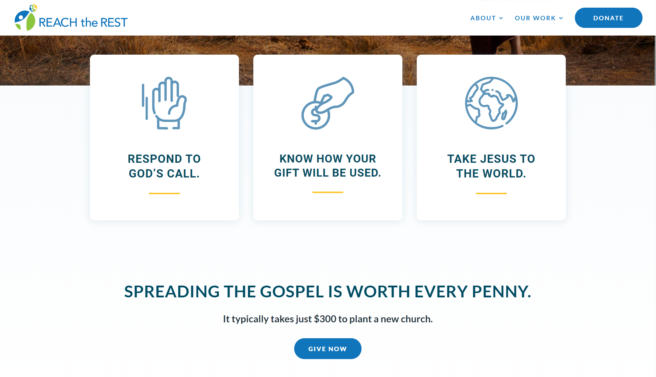
This example comes to us from Reach the Rest, a gospel-oriented non-profit.
The stakes section is arguably the second most critical aspect of your StoryBrand website. This is where you let customers know the cost of not doing business with you.
In other words, how much money are they losing out on by not engaging with your business?
The stakes are like salt in a recipe, add only a little to enhance the flavor. But we do want to include stakes because that introduces the concept of conflict into the brand story. Without it, customers have no reason to buy from you.
Value Proposition
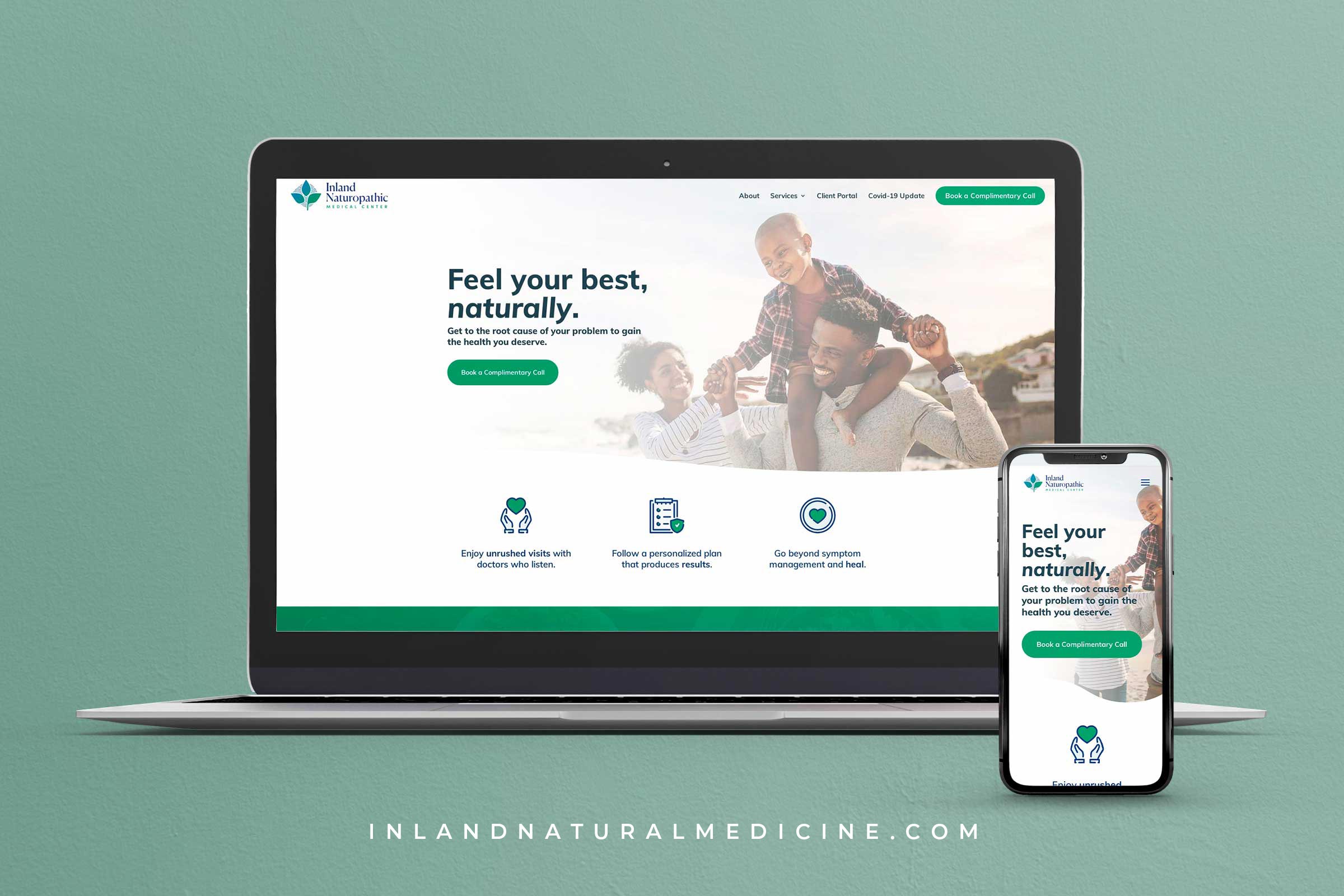
This example comes from one of our friends Good Bureau.
Once we have shaken things up a bit with the stakes, then we can begin to position our product/service as the solution to the conflict the customer is facing.
Again, just like with the stakes section, a little bit goes a long way. We recommend displaying your business’ value in three short paragraphs with icons. StoryBrand refers to this as a “value-stack”.
Communicate your business’ value through short, scannable paragraphs with eye-catching icons and your customers will immediately be able to see how your product/service can fit into their lives.
The Guide
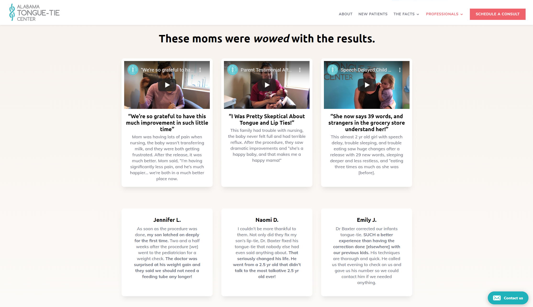
This example comes from the Alabama Tongue-Tie Center.
The guide section is meant to show empathy and authority to your target consumer. It’s supposed to communicate, “I see you. I understand you. And I can help you”.
There are a few ways that you can position yourself as the guide.
Here we see Tongue-Tie highlight several customer testimonials to show both empathy and authority. It’s one thing for you to tell customers you can solve their problem. It’s an entirely different approach to have past customers or clients speak on your behalf.
Tongue-Tie also uses video to show its customer testimonials.
You don’t necessarily have to do this, but it is a nice touch.
Explanatory Paragraph
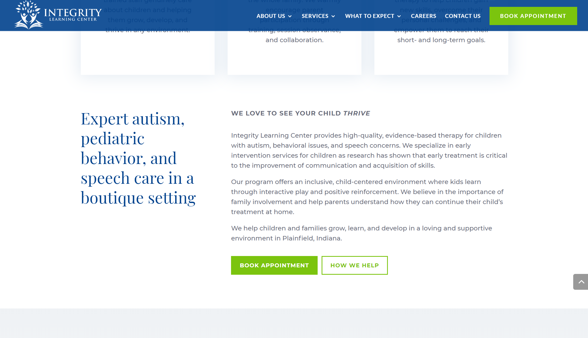
This StoryBrand section comes to us from the Integrity Learning Center.
The explanatory paragraph section is where you get to flex some of your SEO muscles and talk a little bit more about yourself. Of course, we still want to position our brand as the guide.
The explanatory paragraph is simply your BrandScript in a longer, written form. You begin your paragraph by telling who you are as a business, what customers you help, what problems they face, and so-on.
The explanatory paragraph is meant to be another “due-diligence” section that interested customers can go to for more information.
Be sure to explain what you do but always have your copywriting be customer-focused.
The Plan
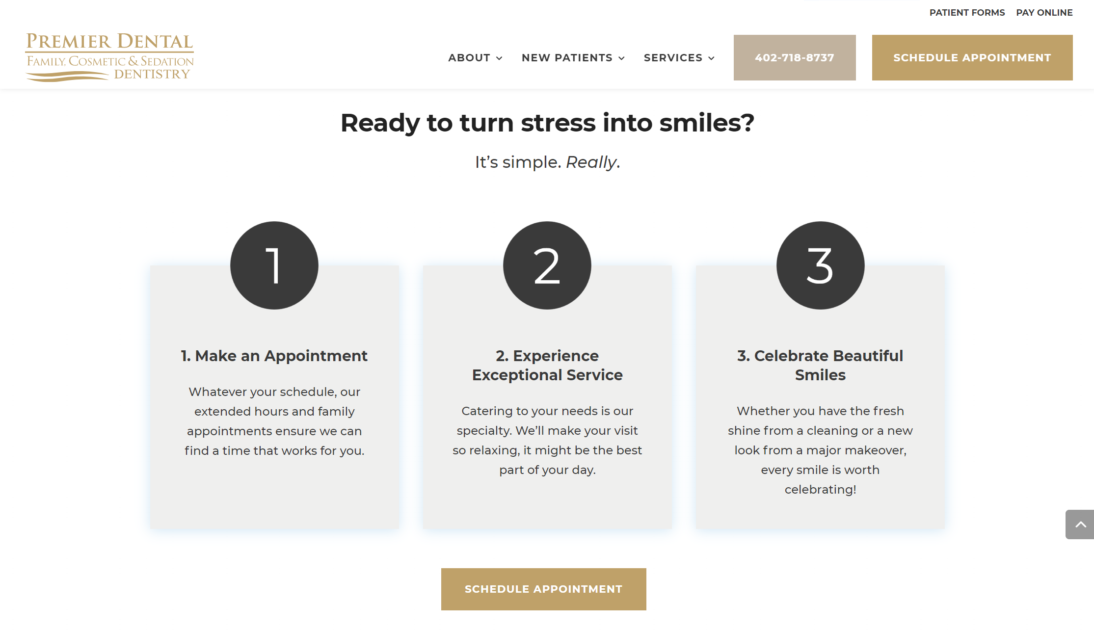
This plan section comes to you from our friends at Premier Dental.
The plan section is simple, and it’s meant to show customers how simple it is to do business with you.
You can illustrate your plan in a simple three-step process.
Include icons that either stand for the steps or icons of numbers like Premier Dental did. Be sure to also include a short 2-3 sentence description of the step so that customers can know what to expect.
It’s as simple as that. Simple. Simple. Simple.
The Video
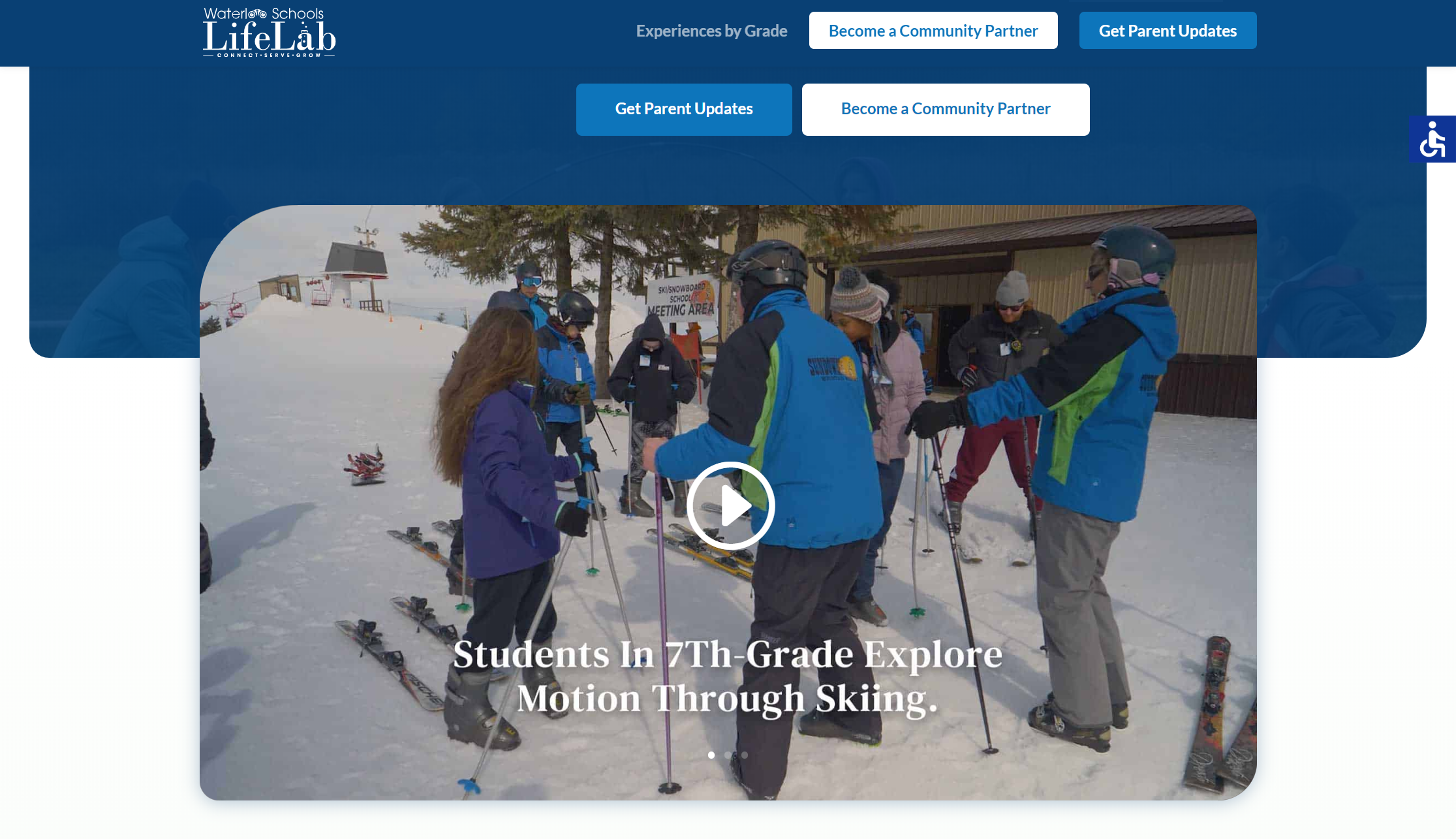
The video section comes to you from Waterloo School Life Lab.
Not every site needs a video section, but it does help as the average consumer becomes more video-oriented.
It’s also another opportunity for you to show off your business and pitch your value proposition.
Like the explanatory paragraph, you can write the video script based on your BrandScript. It doesn’t need to be anything fancy and the video itself could even be a minute long.
Simply having a video allows your customers to engage with your content freshly and it shows to them that you’re relevant and invested in technology. Neither aspect will hurt your brand image.
Price Choices
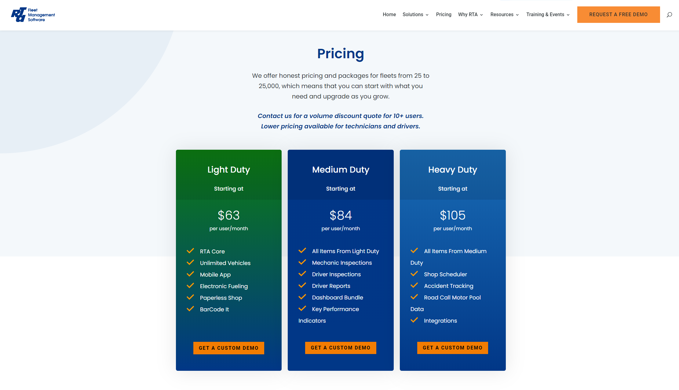
RTA Fleet Management Software highlights their price choices in this section.
If your business has multiple product lines and service offerings, then you’ll certainly want to include price choices on your home page.
We recommend including three price choices to start and write some brief copy of what’s included in those choices along with a direct call-to-action.
Because the human brain is always looking for a fair deal, most customers will opt for the middle-tiered price choice. So, be sure to position your most profitable offering in the middle of the price choices.
Lead Generator
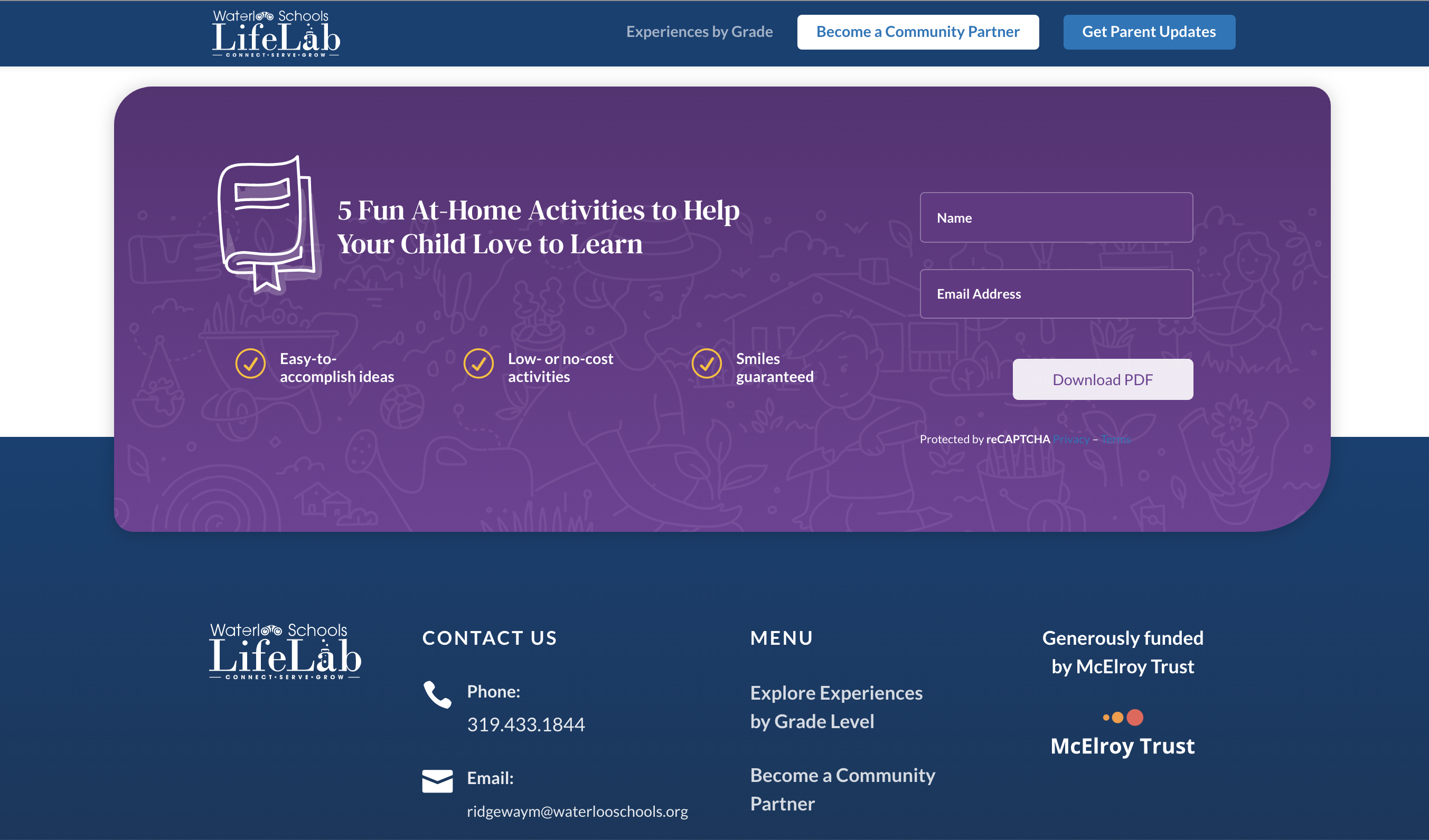
Here we have a lead generator brought to you by Called to Awaken.
It’s wise to include a lead generator on your home page because many website visitors won’t buy on their first go-round.
You will need to feature this lead generator prominently on your home page and it must be something that your target customer wants. For example, a guide, PDF, or video series will suffice.
The lead generator allows you to capture the email address of a prospect and continue to nurture them towards a sale. Losing out on interest prospects is one of the big reasons why so many businesses have dry pipelines.
Don’t let that be you.
Junk Drawer
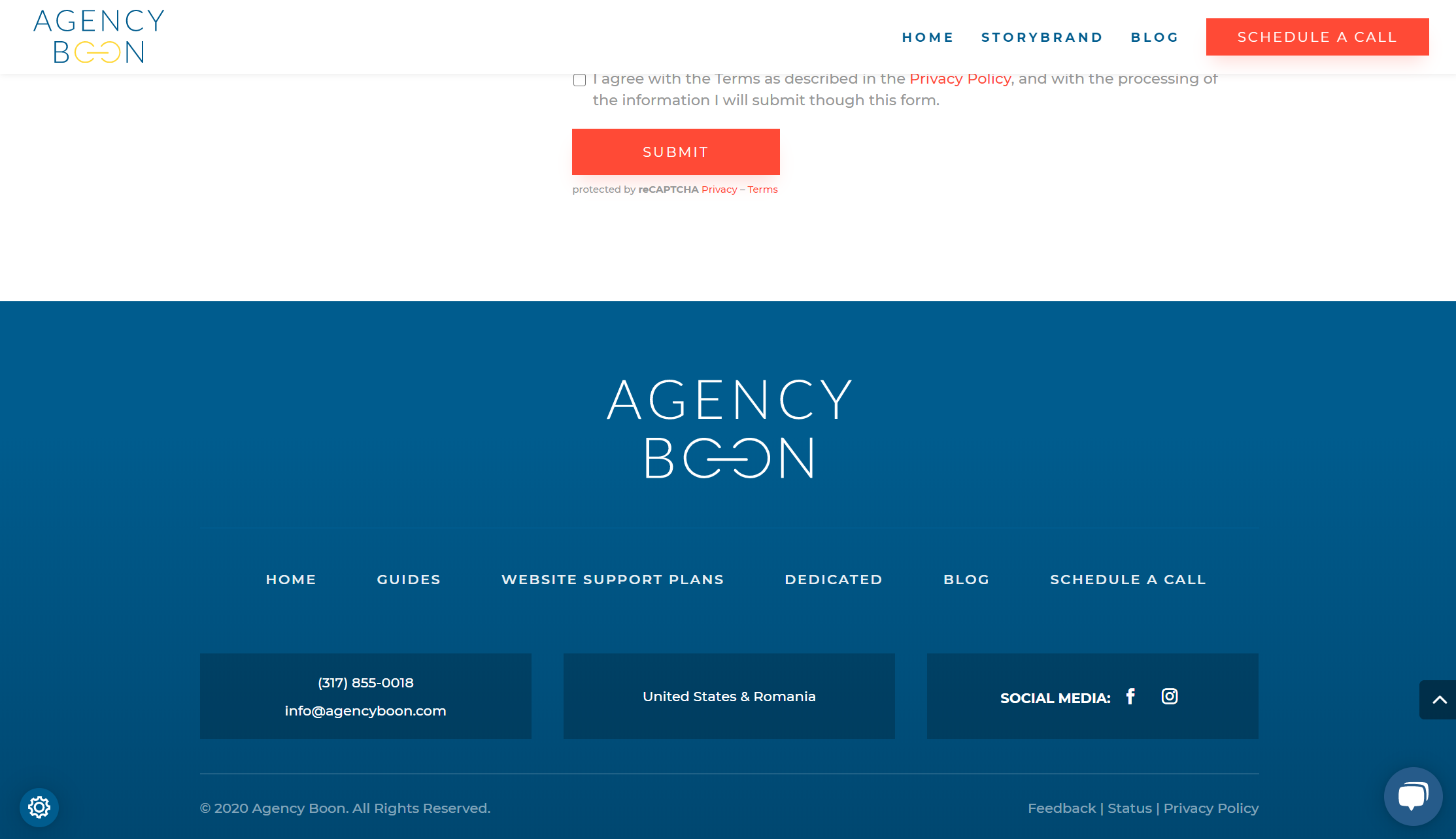
Finally, the last section is the good ole’ junk drawer brought to you by yours truly, Agency Boon.
Your junk drawer is going to be linked to everything that you originally thought was important (i.e., about page, blog page, contact page, etc.).
So, be sure to include all the non-essential links on your navigation bar in the footer (i.e., junk drawer). You’ll see an increase in website metrics and your users will thank you.
The Best StoryBrand Website Examples We’ve Designed
For those that don’t know, we have helped dozens upon dozens of businesses use the StoryBrand framework to create better websites.
In honor of us finding our groove with StoryBranded web design and development, and helping tons of clients along the way, we want to highlight some of the best StoryBrand websites we designed over the last few years.
Waterloo Schools Life Labs
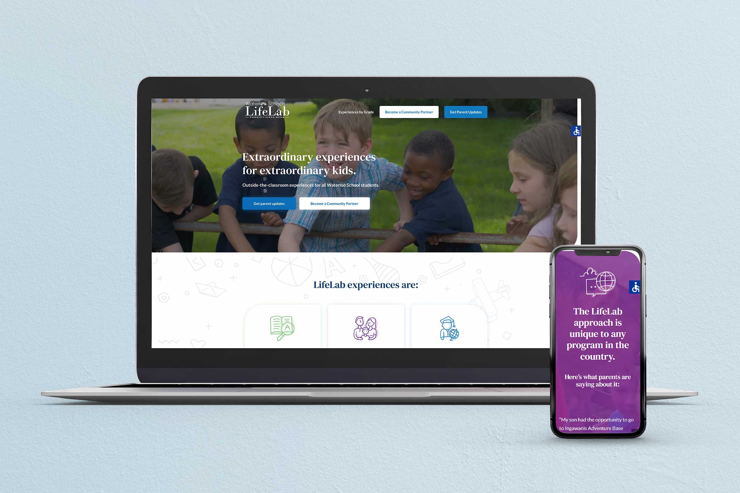
Waterloo Schools Life Labs was such a joy to work with and we are so honored that they chose us as their web design partners.
On the header, we appealed to the fact that kids can be extraordinary. Every parent believes their child is extraordinary and so does Waterloo. So, we wanted to capture this feeling with a spectacular video on the header as well as copy that exemplified these extraordinary students.
We then highlighted Waterloo’s value proposition in the following section of their website.
We then were able to emphasize Waterloo’s empathy and authority by displaying the many partners Waterloo has and the testimonies of parents whose students have been involved in Life Labs.
Of course, we implemented other aspects of the StoryBrand framework (like direct CTAs, explanatory paragraphs, etc.), but these are just a few of the things that we’re extremely proud of. Also, their site is gorgeous!
To see the full website, visit waterloolifelab.com.
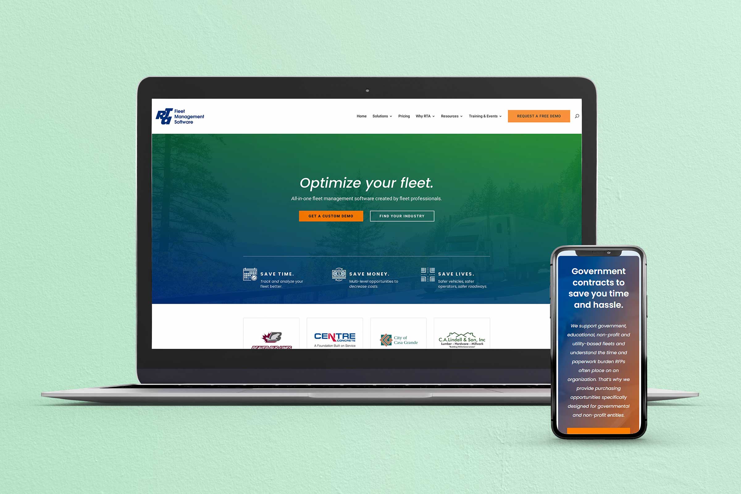
RTA Fleet Management Software
If you have a complex product/service and you’re not sure StoryBrand will work for you, check out our work with RTA Fleet.
This business has many different product lines that require a bit of industry knowledge to purchase. However, that wasn’t a drawback from implementing a clear and concise brand message.
We’re also incredibly proud of the “Stakes Section” where we were able to connect with RTA’s target audience and describe the pain points that this audience was feeling.
Stakes are like salt – add too much and it ruins the recipe, add too little and the meal is bland. Every remarkable story must have conflict, which is why we chose to highlight some pain points that RTA’s audience was feeling. We then positioned RTA’s products as the solution to those pain points that potential customers were feeling.
We were also able to take the concept of “Bite-Sized Revenue Streams” and implement that via the benefits of RTA’s products.
There’s a lot more that we could show you about RTA Fleet’s new website, but why don’t you check it out for yourself.
You can visit their website at rtafleet.com.
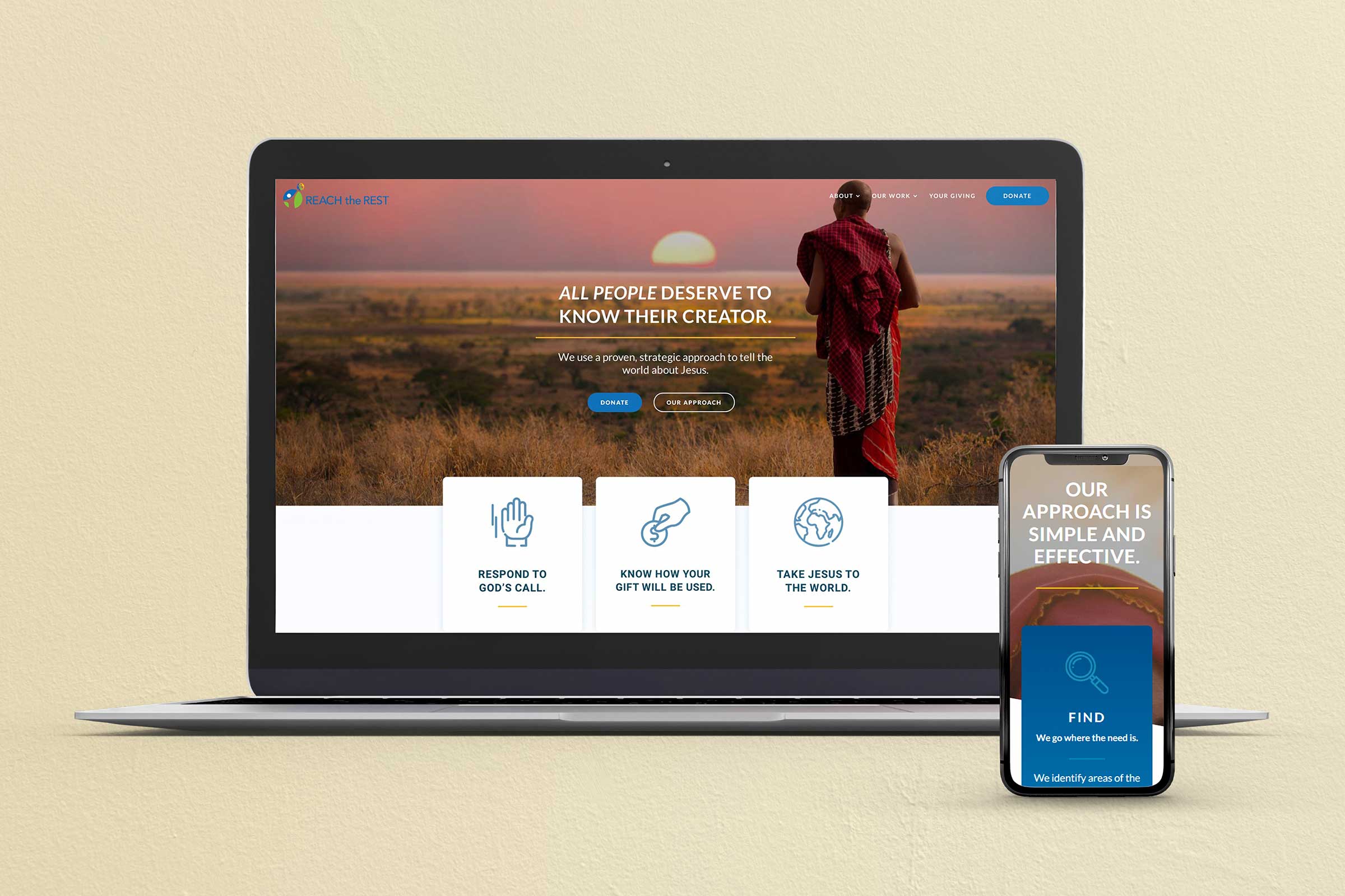
Reach the Rest
Reach the Rest is a gospel-oriented non-profit that aims to tell the world about Jesus. Because it’s a non-profit, Reach the Rest’s main CTA is to donate to the organization. We wanted to make this clear but also highlight how the organization uses financial donations.
We also were able to display the amazing feats that Reach the Rest has carried out by walking out its mission. This was an excellent way for the organization to prove its trust and authority with donor funds.
Finally, we brought their home page to a close by illustrating how simple it is to give to the organization and how easy and fun it is to watch them use your donation. Many non-profits don’t show how they use donor money and even fewer non-profits show how an individual donor’s money gets used. Non-profits can learn a thing or two from Reach the Rest’s donation strategy.
To view the full website, head to https://www.reachtherest.org/.
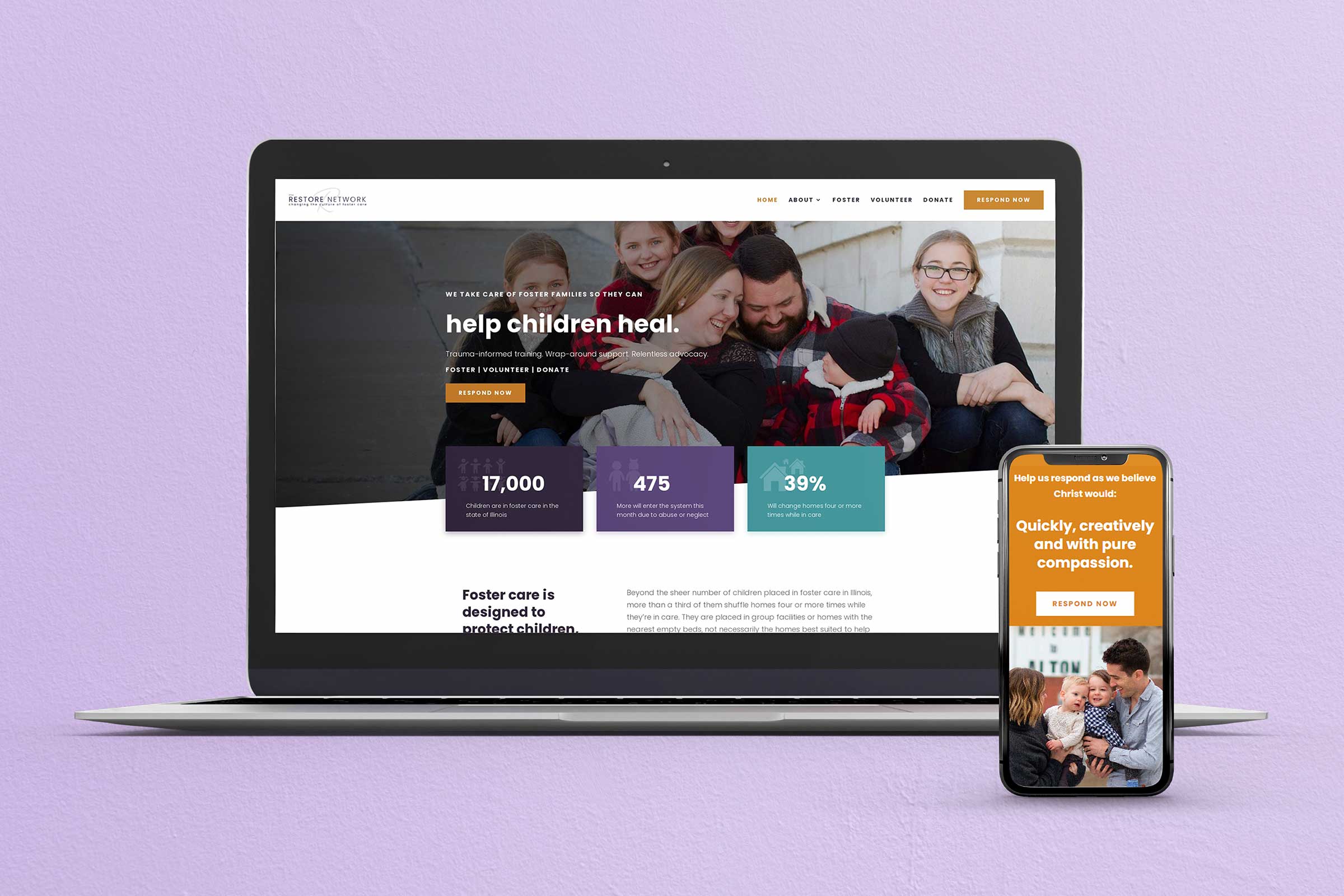
The Restore Network
The Restore Network is a fitting example of how you can double down on the StoryBrand framework on your website.
One section that Donald Miller loves to use on sites is the “Value Stack”. A value stack is typically three icons with short bursts of copy that communicate the value of the brand for a customer. On this site, you can find three value stacks. There’s a lot of value for customers of Restore.
Another unique aspect of this site is the map feature. Restore hammers on the need throughout the web page and, if you wanted to, you could use the map to see the specific need in a particular county. Although it’s not discussed in the StoryBrand method, this is a fitting example of how to stand out, engage potential donors, and capture attention.
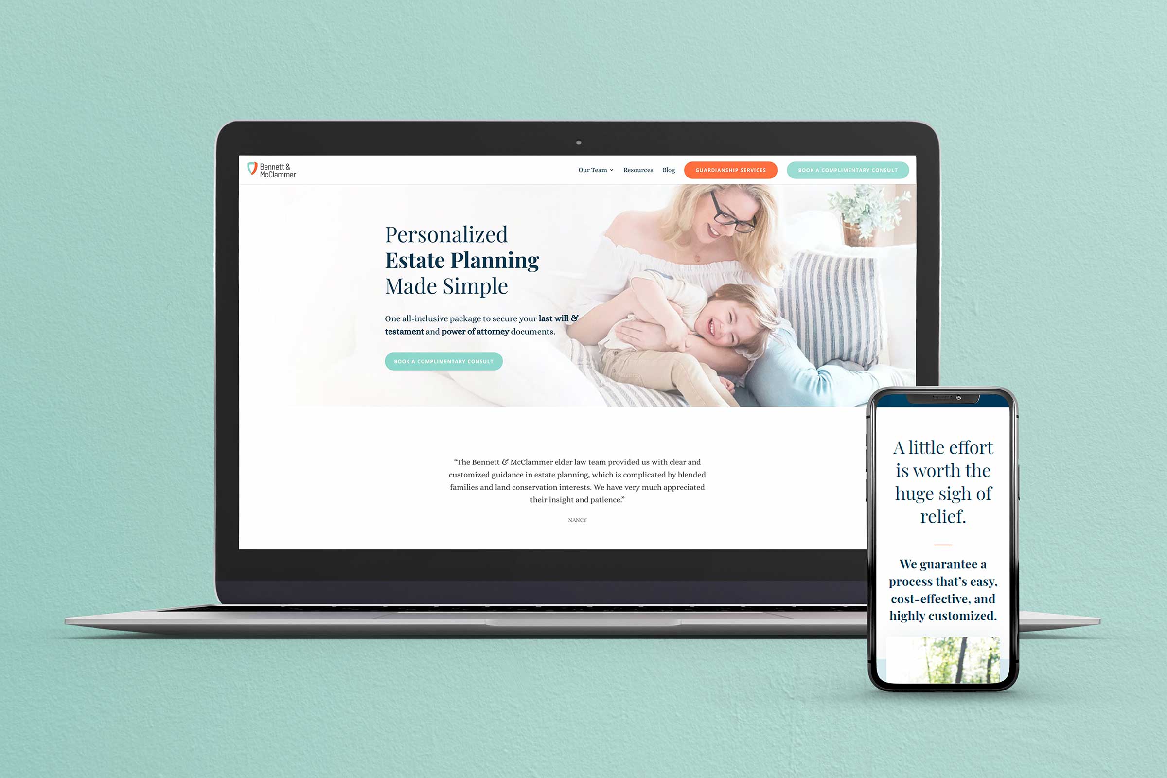
Bennett & McClammer
Bennett & McClammer is taking a Business Made Simple approach to estate planning and wealth building.
The first principle of StoryBrand is “The customer is the hero, not your brand”. And this website is a perfect example of why that works. Every line of copy on this website is customer-focused and interesting. If you want an example of how to write copy for your site, study Bennett & McClammer.
Another part of StoryBrand that this site exemplifies is how few words there are and the brilliant design. Not only is the copy customer-focused, but it also avoids any unnecessary waste. This in addition to the beautiful design makes this site very compelling for a customer rather than a company-drenched bullhorn.
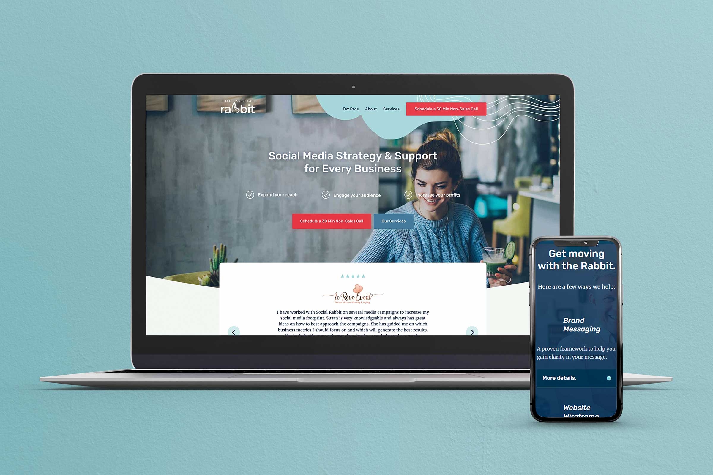
The Social Rabbit
Another amazing example of a StoryBrand website is The Social Rabbit.
StoryBrand principle two is “Companies tend to sell solutions to external problems, but customers buy solutions to internal problems.” Here, on this website, there is a lot of copy directed at a customer’s internal problems as they relate to social media. The Social Rabbit then positions its service perfectly as the solution to the problem.
Even more so, The Social Rabbit offers many different pricing options, packages, and does a fantastic job describing its multiple offers. Pricing choices are also a crucial aspect of a well StoryBranded website.
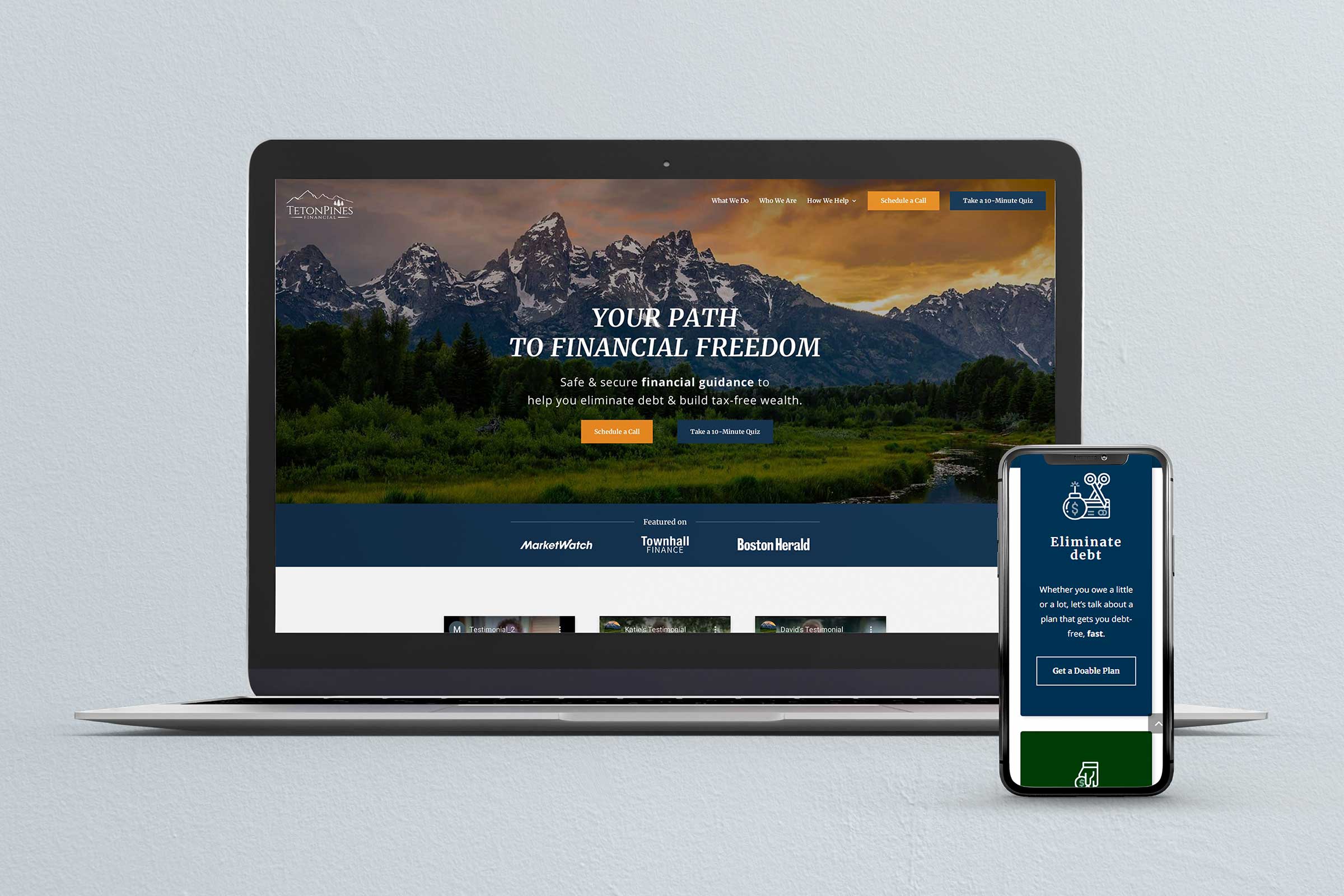
TetonPines Financial
TetonPines Financial helps its customers find their path to financial freedom using the StoryBrand framework.
The hero section of this site is worth noting because of its simplicity, clarity, and aspiration. The very first word that most read when they land on this site is “You”. That is exceptionally well-written copy and strategically chosen to be the first thing visitors see.
StoryBrand principle five states “Customers do not take action unless they are challenged to take action.” This site is incredibly clear with what it wants customers to do if they want to do business – Schedule a call.
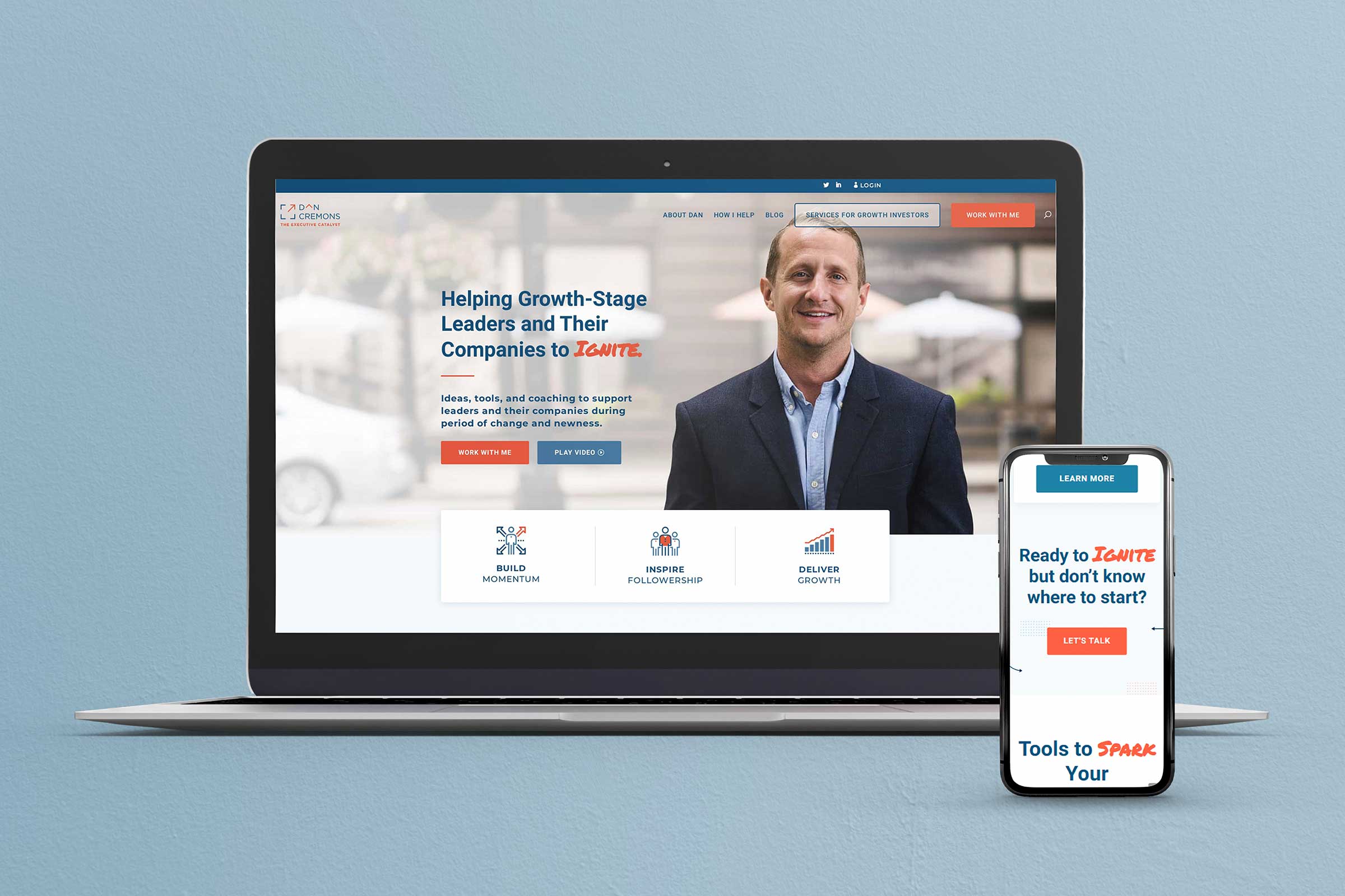
Dan Cremons
The final StoryBrand website example comes from Dan Cremons, the consultant and executive catalyst.
One reason we love working with consultants and solopreneurs is that it’s a challenge to tell an individual’s story while having that story be customer-centric. But this website does exactly that.
The final StoryBrand principle, number seven, is “Never assume people understand how your brand can change their lives. Tell them.” Dan’s site not only positions him as the guide, but it also shows us how working with him can change our businesses. This is not only an effective sales tactic but also a fantastic way to appeal to an aspirational identity.
Every Business Should Experience The Benefits Of A StoryBranded Website
Whether you’re just starting to wireframe your website or you’re ready to bring in a team to begin development, we can help you every step of the journey.
